
Giving a landmark tourism strategy the engaging digital home it deserved.
www.regenerativetourism.co.nz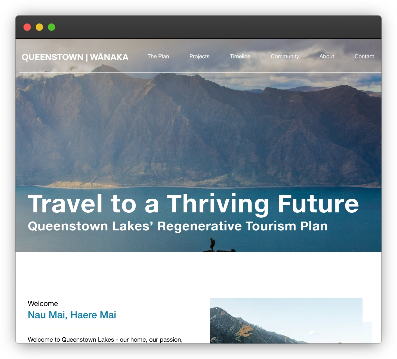


"Impact were instrumental in bringing our vision for regenerativetourism.co.nz to life. Their expertise in web design and UX helped us transform our Destination Management Plan (DMP) into an accessible, user-friendly digital platform. What stood out was their ability to translate complex strategic content into a clear, engaging website that serves diverse stakeholders - from local businesses to visitors."
Destination Queenstown is the regional tourism organization responsible for stewarding the future of tourism in one of the world's most iconic destinations. Their Regenerative Tourism strategy is the blueprint for that future.
The Brief
While we typically advise against full rebuilds in favour of iterative optimization, the Regenerative Tourism program presented a unique challenge. Its home was a restrictive microsite shoehorned into the main Destination Queenstown website. This created a fundamentally broken user journey, forcing key stakeholders down confusing paths and burying critical strategic information inside dense PDFs.
The goal wasn't just a redesign; it was to fix a flawed conversion funnel. We needed to stop losing engaged users, make the strategy accessible, and create a platform that could successfully convert visitors into informed, supportive stakeholders.
The Research & Key Insights
Taking a research-first approach, we analyzed the existing user journey and identified critical flaws that were hindering engagement and task completion.
- The PDF is Where Engagement Went to Die: The single biggest conversion killer was the reliance on a dense, multi-page PDF. Users seeking to understand the strategy were forced to download an external file—a massive point of friction that led to significant drop-off. Key information was present, but it was inaccessible.
- A Fractured Journey with No Clear Path: The microsite structure created a disjointed experience. There was no logical flow for different audiences, such as local business operators, government partners, or community members. Each segment had a unique "job-to-be-done," but they were all forced down a single, ineffective path that failed to meet their needs.
- One-Size-Fits-None Layout: The constrained layout of the parent site meant the content couldn't be presented in a clear, compelling way. It failed to build a narrative or guide users to the most relevant information, resulting in confusion and high bounce rates.
The Approach
Our approach was a strategic intervention designed to fix the core user journey and build a foundation for sustained engagement.
1. Fixing the User Flow
Before touching the design, we rebuilt the information architecture from the ground up using the Jobs-to-Be-Done framework. By mapping the primary task for each key audience, we created clear, logical pathways that guided users directly to the information they needed. Moving the program to its own domain (regenerativetourism.co.nz) was the critical first step in creating these dedicated user journeys.
2. Eliminating Friction & Surfacing Value
We treated the core PDF as a conversion blocker and systematically eliminated it. The essential strategic material was synthesized, rewritten for the web, and surfaced in concise, scannable sections on the site. This crucial step replaced a high-effort download with a low-effort, on-page experience, making the program's value immediately clear.
3. Validating the New Journey
To de-risk the build, we developed a full, clickable prototype in Figma. This allowed us to test and validate our new, optimized user flows with key stakeholders. It ensured the new structure worked for its intended audiences and allowed us to gather feedback quickly, preventing costly rework and aligning everyone on the solution.
The Results
The new, focused platform transformed the program's ability to connect with its audience, delivering measurable improvements in user behaviour.
- User engagement and time on page increased significantly as visitors could now easily find and consume the information they were looking for.
- Accessibility for all stakeholders was vastly improved, with clear pathways for operators, partners, and the community to complete their core tasks.
- The editor-friendly CMS empowers the team to publish fresh content, enabling continued optimization and keeping the community engaged with new projects, stories, and progress updates.
By fixing the broken user journey, we turned a static, frustrating microsite into a dynamic and effective platform that is easy to navigate, easy to update, and designed around what users actually came to do.